PloticusPlugin
PloticusPlugin allows for dynamic rendering and display of a Ploticus graph in a TWiki topic. This plugin is basically a rip off of TWiki:Plugins.GnuPlotPlugin - thanks Abie!On this page:
- Syntax Rules
- Examples
- Pie Chart, Simple
- Pie Chart, Automatic Percentages
- Pie Chart, Exploded
- Pie Chart, Half Moon Layout
- Composition Percentages
- Accrual Graph (Datafile based)
- Chronological Flow (Datafile based)
- Clustered Vertical Bars, Comparing Values
- Vector Display, Wind Directions (Datafile based)
- Heat Map
- Curve Fit
- Multi Scatter Graphs
- Drawing in Ploticus, Logo
- Plugin Settings
- Plugin Installation Instructions
- Plugin Info
Syntax Rules
- Add
%PLOTICUSPLOT{"PlotName"}%in a topic (where you want the plot to appear) and save the topic - Multiple plots can be displayed within one topic
- Any CSV (Comma Seperated Variable) files attached to the topic can be used with the ploticus command (see examples)
<ploticus name="PLOT_NAME">
Ploticus plot data ...
...
</ploticus>
- Set INLINE = on
Examples
Below are a few pre-rendered examples of what plots produced with ploticus looks like - for more examples and full syntax documentation please visit Ploticus' homepage at http://ploticus.sourceforge.net/.Pie Chart, Simple
Simple pie chart, only chart + legend.
Pre-rendered sample (PieChartSimple):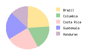
|
Plugin (PieChartSimple): %PLOTICUSPLOT{"PieChartSimple"}% |
Verbatim (PieChartSimple):
%PLOTICUSPLOT{"PieChartSimple"}%

Plot settings:
#proc page
#if @DEVICE in gif,png
  scale: 1.2
#endif
//  specify data using proc getdata
#proc getdata
data:
 Brazil        22
 Columbia      17
 "Costa Rica"  22
 Guatemala     19
 Honduras      12

//  render the pie graph using proc pie
#proc pie
datafield: 2
labelfield: 1
labelmode: legend
outlinedetails: none
center: 2 2
radius: 0.6
colors: dullyellow drabgreen pink powderblue lavender
labelfarout: 1.3

//  render the legend using entries made above, using proc legend
#proc legend
location: 3 2.6
|
Pie Chart, Automatic Percentages
Pie chart with automatic percentage values (taken from absoute data values).
Pre-rendered sample (PieChartAutomaticPercent):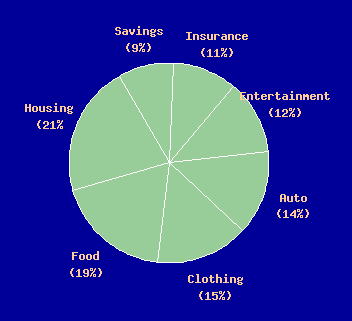
|
Plugin (PieChartAutomaticPercent): %PLOTICUSPLOT{"PieChartAutomaticPercent"}% |
Verbatim (PieChartAutomaticPercent):
%PLOTICUSPLOT{"PieChartAutomaticPercent"}%

Plot settings:
//  set the background to gray using proc page
#proc page
backgroundcolor: darkblue
#if @DEVICE in gif,png
  scale: 1.0
#endif

//  specify data using proc getdata
#proc getdata
data:
12 SAV
14 INS
16 ENT
18 AUT
20 CLO
25 FOO
28 HOU

//  render the pie graph using proc pie
#proc pie
firstslice: 330
datafield: 1
labelmode: labelonly
center: 4 3
radius: 1
colors: drabgreen
labelfarout: 1.3
outlinedetails: color=white
textdetails: color=lightorange size=10
pctformat: %.0f
labels:
 Savings\n(@@PCT%)
 Insurance\n(@@PCT%)
 Entertainment\n(@@PCT%)
 Auto\n(@@PCT%)
 Clothing\n(@@PCT%)
 Food\n(@@PCT%)
 Housing\n(@@PCT%)
|
Pie Chart, Exploded
Pie chart with two slices exploded.
Pre-rendered sample (PieChartExploded):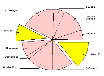
|
Plugin (PieChartExploded): %PLOTICUSPLOT{"PieChartExploded"}% |
Verbatim (PieChartExploded):
%PLOTICUSPLOT{"PieChartExploded"}%

Plot settings:
#proc page
#if @DEVICE in gif,png
  scale: 0.5
#endif

//  specify data using proc getdata
#proc getdata
data:
 Brazil          22
 Columbia        17
 "Costa Rica"    22
 Guatemala        3
 Honduras        12
 Mexico          14
 Nicaragua       28
 Belize           9
 United\nStates  21
 Canada           8

//  render the pie graph using proc pie
#proc pie
clickmapurl: @CGI?country=@@1&n=@@2
firstslice: 90
explode: .2 0 0 0 0  .2 0
datafield: 2
labelfield: 1
labelmode: line+label
center: 4 4
radius: 2
colors: yellow pink pink pink pink yellow pink
labelfarout: 1.05
|
Pie Chart, Half Moon Layout
Pie chart, "half moon" layout.
Pre-rendered sample (PieChartHalfMoon):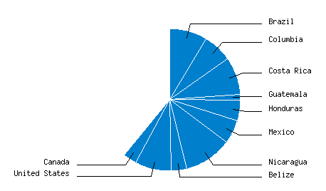
|
Plugin (PieChartHalfMoon): %PLOTICUSPLOT{"PieChartHalfMoon"}% |
Verbatim (PieChartHalfMoon):
%PLOTICUSPLOT{"PieChartHalfMoon"}%

Plot settings:
//  specify data using proc getdata
#proc getdata
data:
 Brazil           22
 Columbia         17
 "Costa Rica"     22
 Guatemala         3
 Honduras         12
 Mexico           14
 Nicaragua        28
 Belize            9
 "United States"  21
 Canada            8

//  render the pie graph using proc pie
#proc pie
datafield: 2
labelfield: 1
labelmode: line+label
center: 4 3
radius: 1
colors: oceanblue
outlinedetails: color=white
labelfarout: 1.3
total: 256
|
Composition Percentages
Example of intuitive display of oil component percentages.
Pre-rendered sample (FatsContent):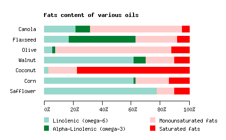
|
Plugin (FatsContent): %PLOTICUSPLOT{"FatsContent"}% |
Verbatim (FatsContent):
%PLOTICUSPLOT{"FatsContent"}%

Plot settings:
// Specify the data using proc getdata
// Each value is an individual percentage.

#proc page
  landscape: yes

#proc getdata
//oil      lin alph mono  sat
data:
 Canola     22   10   63    5
 Flaxseed   17   46   29    8
 Olive       6    2   80   12
 Walnut     62    8   20   10
 Coconut     3    0   20   77
 Corn       62    1   23   14
 Safflower  78    0   12   10

//  define plotting area using proc areadef
#proc areadef
  title: Fats content of various oils
  rectangle: 1 1 4 2.7
  xrange: 0 100
  yrange: 0 8

//  do y axis stubs (oil names) using proc yaxis
#proc yaxis
  stubs: datafields 1
  grid: color=powderblue
  axisline: none
  tics: no

//  do x axis stubs (percents) using proc xaxis
#proc xaxis
  stubs: inc 20
  stubformat: %3.0f%%

//  do light green bars using proc bars
#proc bars
  horizontalbars: yes
  barwidth: 0.13
  lenfield: 2
  color: rgb(.6,.85,.8)
  outline: no
  legendlabel: Linolenic (omega-6)
  #saveas: B

//  do dark green bars
// Use stackfields to position bars beyond the first set of bars
#proc bars
  #clone B
  lenfield: 3
  stackfields: 2
  legendlabel: Alpha-Linolenic (omega-3)
  color: teal

//  do pink bars
// Use stackfields to position bars beyond the first two sets of bars
#proc bars
  #clone B
  lenfield: 4
  stackfields: 2 3
  legendlabel: Monounsaturated fats
  color: pink

// do red bars
// Use stackfields to position bars beyond the first three sets of bars
#proc bars
  #clone B
  lenfield: 5
  stackfields: 2 3 4
  legendlabel: Saturated fats
  color: red

//  do legend (1st column) using proc legend
// the noclear attribute must be specified otherwise the entries are removed
// we need to keep them for the 2nd invocation, below..
#proc legend
  location: min+0.2 min-0.3
  noclear: yes
  specifyorder: Lin
       alpha

//  do legend (2nd column) using proc legend
#proc legend
  location: min+2.4 min-0.3
  specifyorder: Mono
       Satu
|
Accrual Graph (Datafile based)
Display of forecast and actual growth. Annotated.
Pre-rendered sample (Accrual):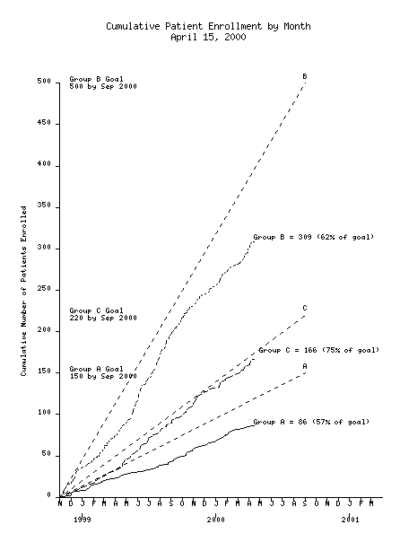
|
Plugin (Accrual): %PLOTICUSPLOT{"Accrual"}% |
Verbatim (Accrual):
%PLOTICUSPLOT{"Accrual"}%

Plot settings:
// patient accrual plot.
// Usage pl accrual.p [CUTDATE=mmddyy]
//
// This will plot directly from the MMDDYY dates in field# 5 of accrual.dat
//
#setifnotgiven CUTDATE = 041500
#set XMIN = "110198"
#set XMAX = "033101"
#set NICECUTDATE = $formatdate(@CUTDATE,full)

//
// do page title..
#proc page
pagesize: 8.5 11
#if @DEVICE in gif,png
  scale: 0.6
#endif
title:      Cumulative Patient Enrollment by Month
      @NICECUTDATE

//
// read the data file..
#proc getdata
file:      accrual.dat
select:      $daysdiff(@@5,040197) >= 0 && $daysdiff(@@5,@CUTDATE) <= 0

//
// set up plotting area..
#proc areadef
rectangle:   1.5 1.5 7.5 9.2

xrange:      @XMIN @XMAX
xscaletype:     date
xaxis.stubs:    incremental 1 month
xaxis.stubformat: M

yrange:      0 500
yaxis.stubs:   incremental 50
yaxis.label:   Cumulative Number of Patients Enrolled
yaxis.labeldetails: adjust=-0.2,0

// do a second x axis to put in years
#proc xaxis
stubs:      incremental 12 months
axisline:   none
location:   min-0.3
stubrange:   010199
stubformat:   YYYY

// =====================
// do group A curve, using instancemode/groupmode to count instances,
// and accum to accumulate..
// Use the select attribute to get only group A
#proc lineplot
xfield:      5
accum:      y
instancemode:   yes
groupmode:   yes
select:      @@4 == A && $daysdiff(@@5,040197) >= 0
lastx:      @CUTDATE
#saveas:   L
#endproc

// calculate group A pct of goal (150) and format to NN..
#set PCTOFGOAL = $arith(@YFINAL/1.5)
#set PCTOFGOAL = $formatfloat(@PCTOFGOAL,%2.0f)

// render line label with percentage
#proc annotate
  location: @XFINAL(s) @YFINAL(s)
  textdetails: size=8 align=L
  text: Group A = @YFINAL (@PCTOFGOAL% of goal)

// =====================
// do group B curve
#proc lineplot
#clone:      L
linedetails: style=1 dashscale=3
linerange:   9806
select:      @@4 == B && $daysdiff(@@5,060198) >= 0
#endproc

// calculate group B pct of goal (500) and format to NN..
#set PCTOFGOAL = $arith(@YFINAL/5.0)
#set PCTOFGOAL = $formatfloat(@PCTOFGOAL,%2.0f)

// render line label with percentage..
#proc annotate
  location: @XFINAL(s) @YFINAL(s)
  textdetails: size=8 align=L
  text: Group B = @YFINAL (@PCTOFGOAL% of goal)

// =====================
// do group C curve
#proc Lineplot
#clone:      L
linedetails: style=2 dashscale=3
select:      @@4 == C && $daysdiff(@@5,060198) >= 0
#endproc

// calculate group C pct of goal (220) and format to NN..
#set PCTOFGOAL = $arith(@YFINAL/2.2)
#set PCTOFGOAL = $formatfloat(@PCTOFGOAL,%2.0f)

// render line label with percentage..
#proc annotate
  location: @XFINAL(s) @YFINAL(s)
  textdetails: adjust=0.1,+0.1 size=8 align=L
  text: Group C = @YFINAL (@PCTOFGOAL% of goal)

// draw the goal lines...
#proc drawcommands
commands:
   textsize 8
        linetype 1 0.2 4
//
   movs @XMIN min
   lins 090100 150
//
   movs @XMIN min
   lins 090100 500
//
   movs @XMIN min
   lins 090100 220

// do the goal annotations
#proc annotate
  location:  1.7 150(s)
  textdetails: align=L size=8
  text: Group A Goal
   150 by Sep 2000

#proc annotate
  location: 1.7 500(s)
  textdetails: align=L size=8
  text: Group B Goal
   500 by Sep 2000

#proc annotate
  location: 1.7 220(s)
  textdetails: align=L size=8
  text: Group C Goal
   220 by Sep 2000

#proc annotate
  location: 090100(s) 153(s)
  text: A

#proc annotate
  location: 090100(s) 503(s)
  text: B

#proc annotate
  location: 090100(s) 223(s)
  text: C
|
Chronological Flow (Datafile based)
Display of session data extracted from logfile, Microsoft Project style.
Pre-rendered sample (Sessions):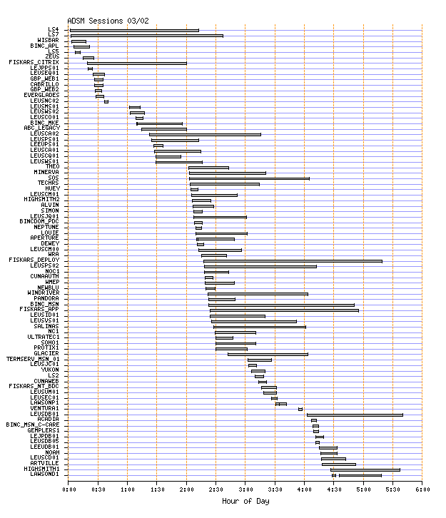
|
Plugin (Sessions): %PLOTICUSPLOT{"Sessions"}% |
Verbatim (Sessions):
%PLOTICUSPLOT{"Sessions"}%

Plot settings:
#proc page
pagesize: 8.5 9.6
#if @DEVICE in gif,png
  scale: 0.8
#endif

#proc getdata
  delim: comma
  file: sess03022000.dat

#proc areadef
  title: ADSM Sessions 03/02
  areaname: whole
  xscaletype: time hh:mm:ss
  xrange: 00:00 06:00
  yscaletype: categories
  ycategories: datafield 4
//  frame: bevel

// #proc originaldata

#proc yaxis
  stubs: categories
  grid: color=powderblue

#proc xaxis
  stubs: inc 30
  stubformat: hh:mm
  grid: color=orange style=2
  label: Hour of Day

#proc bars
  axis: x
  locfield: 4
  segmentfields: 2 3
  barwidth: 0.035
  tails: 0.05
|
Clustered Vertical Bars, Comparing Values
Traditional display of past-present, before-after values.
Pre-rendered sample (ClusteredVertBars):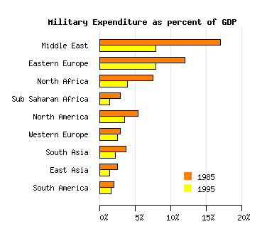
|
Plugin (ClusteredVertBars): %PLOTICUSPLOT{"ClusteredVertBars"}% |
Verbatim (ClusteredVertBars):
%PLOTICUSPLOT{"ClusteredVertBars"}%

Plot settings:
//  Specify data using proc getdata
#proc getdata
data:
// region            1985 1995
  "Middle East"       17   8
  "Eastern Europe"    12   8
  "North Africa"     7.5   4
  "Sub Saharan Africa" 3   1.5
  "North America"    5.5   3.5
  "Western Europe"     3   2.5
  "South Asia"       3.7   2.2
  "East Asia"        2.5   1.5
  "South America"      2   1.6

//  Define plotting area using proc areadef
#proc areadef
  title: Military Expenditure as percent of GDP
  titledetails: adjust=-0.4,0 align=C
  rectangle: 2 1 4 3.5
  yrange: 0 10
  xrange: 0 20

//  Set up X axis using proc axis
#proc xaxis
  stubs: inc 5
  stubformat: %3.0f%%
  grid: color=gray(0.9)

//  Do Y axis using proc axis
#proc yaxis:
  stubs: datafields 1
  tics: none
  axisline: none

//  Do orange bars using proc bars
#proc bars
  horizontalbars: yes
  color: redorange
  lenfield: 2
  cluster: 1 / 2
  barwidth: 0.08
  legendlabel: 1985

//  Do blue bars using proc bars
#proc bars
  horizontalbars: yes
  // color: powderblue
  color: yellow
  lenfield: 3
  cluster: 2 / 2
  barwidth: 0.08
  legendlabel: 1995

//  Do legend using proc legend
#proc legend
  location: max-0.6 min+0.5
|
Vector Display, Wind Directions (Datafile based)
Example: Wind directions in relation to altitude.
Pre-rendered sample (WindDirection):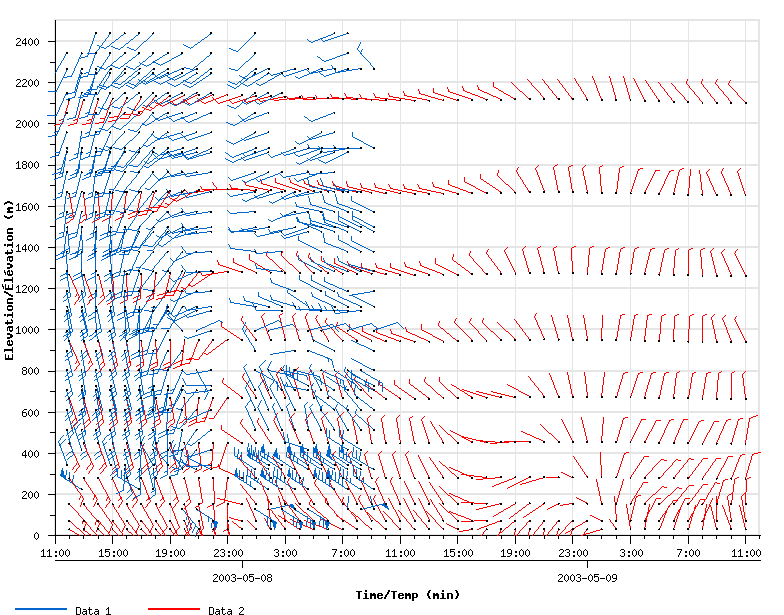
|
Plugin (WindDirection): %PLOTICUSPLOT{"WindDirection"}% |
Verbatim (WindDirection):
%PLOTICUSPLOT{"WindDirection"}%

Plot settings:
// Setup drawing area
#proc page
  pagesize: 8 6
  landscape: yes

#proc areadef
  rectangle: 0.55 0.80 7.6 5.95
  frame: color=grey(0.9)
  xscaletype: datetime yyyy-mm-dd.hh:mm:ss
  xrange: 2003-05-07.11:00:00 2003-05-09.12:00:00
  yrange: 0 2500

#proc xaxis
  stubs: incremental 4 hour
  stubformat: hh:mm
  stubcull: yes
  stubrange: 2003-05-07.11:00:00
  minorticinc: 1 hour
  grid: color=grey(0.9)
  gridskip: min

#proc xaxis
  location: min-0.25
  stubs: incremental 1 day
  stubrange: 2003-05-07.24:00:00
  stubformat: yyyy-mm-dd
  minorticinc: 1 day
  stubcull: yes
  label: Time/Temp (min)

#proc yaxis
  stubs: incremental 200
  minorticinc: 100
  stubdetails: size=8
  labeldetails: size=10
  grid: color=grey(0.9) width=1
  gridskip: min
  label: Elevation/�l�vation (m)
  minorticlen: 0.05

// Wind data
#proc getdata
  delim: comma
  file: wind.csv
  fieldnameheader: yes
  pf_fieldnames: legendId,windTimeStamp,windLevel,windSpeed,windDirection
  filter: ##set newWindTimeStamp = $change(' ', '.', @@windTimeStamp)
     ##print @@legendId,@@newWindTimeStamp,@@windLevel,@@windSpeed,@@windDirection

// Wind legend entries
#proc legendentry
  label: Data 1
  sampletype: line
  details: color=blue
  tag: 1

#proc legendentry
  label: Data 2
  sampletype: line
  details: color=red
  tag: 2

// Draw the windbarbs
#proc vector
  xfield: windTimeStamp
  yfield: windLevel
  linedetails: color=black
  magfield: windSpeed
  dirfield: windDirection
  colorfield: legendId
  type: barb
  constantlen: 0.25

// Draw dots at the points of the windbarbs
#proc scatterplot
  xfield: windTimeStamp
  yfield: windLevel
  symbol: shape=circle radius=0.005 style=fill fillcolor=black
  cluster: no

#proc legend
  location: min+0.21 min-0.65
  //details: size=12 color=black style=B
  sep: 1
  format: singleline

#proc legend
  reset
|
Heat Map
When presenting this color grid Ploticus processes the raw data by counting occurances within ranges, then mapping counts to colors by range.
Pre-rendered sample (HeatMap):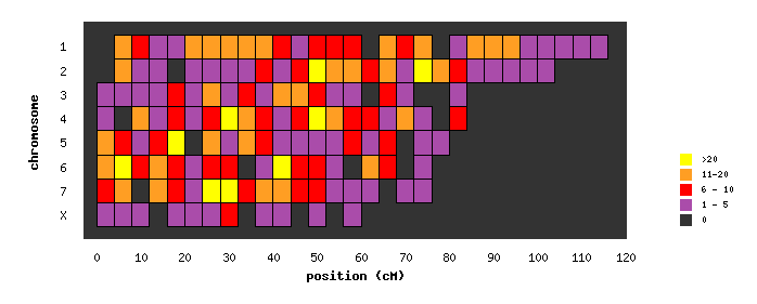
|
Plugin (HeatMap): %PLOTICUSPLOT{"HeatMap"}% |
Verbatim (HeatMap):
%PLOTICUSPLOT{"HeatMap"}%

Plot settings:
#set SYM = "radius=0.08 shape=square style=filled"
#setifnotgiven CGI = "http://ploticus.sourceforge.net/cgi-bin/showcgiargs"


// read in the SNP map data file..
#proc getdata
file: snpmap.dat
fieldnameheader: yes

// group into bins 4 cM wide..
filter:
   ##set A = $numgroup( @@2, 4, mid )
   @@1 @@A

// set up the plotting area
#proc areadef
rectangle: 1 1 6 3
areacolor: gray(0.2)
yscaletype: categories
clickmapurl: @CGI?chrom=@@YVAL&cM=@@XVAL
ycategories:
 1
 2
 3
 4
 5
 6
 7
 X

yaxis.stubs: usecategories
// yaxis.stubdetails: adjust=0.2,0
//yaxis.stubslide: 0.08
yaxis.label: chromosome
yaxis.axisline: no
yaxis.tics: no
yaxis.clickmap: xygrid

xrange: -3 120
xaxis.label: position (cM)
xaxis.axisline: no
xaxis.tics: no
xaxis.clickmap: xygrid
xaxis.stubs: inc 10
xaxis.stubrange: 0
// xaxis.stubdetails: adjust=0,0.15


// set up legend for color gradients..
#proc legendentry
sampletype: color
details: yellow
label: >20
tag: 21

#proc legendentry
sampletype: color
details: orange
label: 11-20
tag: 11

#proc legendentry
sampletype: color
details: red
label: 6 - 10
tag: 6

#proc legendentry
sampletype: color
details: lightpurple
label: 1 - 5
tag: 1

#proc legendentry
sampletype: color
details: gray(0.2)
label: 0
tag: 0


// use proc scatterplot to count # of instances and pick appropriate color from legend..
#proc scatterplot
yfield: chr
xfield: cM
cluster: yes
dupsleg: yes
rectangle: 4 1 outline

// display legend..
#proc legend
location: max+0.7 min+0.8
textdetails: size=6
|
Curve Fit
Sliding averages, automatically generated.
Pre-rendered sample (StockCurveFit):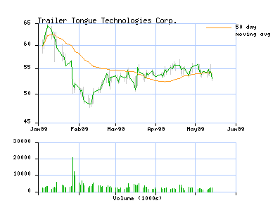
|
Plugin (StockCurveFit): %PLOTICUSPLOT{"StockCurveFit"}% |
Verbatim (StockCurveFit):
%PLOTICUSPLOT{"StockCurveFit"}%

Plot settings:
#proc page
#if @DEVICE in gif,png
  scale: 0.7
#endif

// read data file using proc getdata
#proc getdata
file: stock.csv
delimit: comma
//showresults: yes

// reverse the record order, since the data is provided in reverse chronological
// order, using proc processdata
#proc processdata
action: reverse

// define top plotting area using proc areadef
#proc areadef
title: Trailer Tongue Technologies Corp.
rectangle: 1 3 5 5
xscaletype: date dd-mmm-yy
xrange: 01-Jan-99 01-Jun-99
yrange: 45 65
yscaletype: log
#saveas: A

// set up X axis using proc xaxis
#proc xaxis
stubs: inc 1 month
stubformat: Mmmyy
grid: color=skyblue

// set up Y axis using proc yaxis
#proc yaxis
stubs: inc 5
grid: color=skyblue

// draw hi low bars using proc bars
#proc bars
locfield: 1
segmentfields: 3 4
thinbarline: color=gray(0.8)

// draw closing price curve using proc lineplot
#proc lineplot
xfield: 1
yfield: 5
linedetails: width=0.3 color=green

// compute and render moving average curve using proc curvefit
#proc curvefit
xfield: 1
yfield: 5
order: 50
legendlabel: 50 day\nmoving avg
linedetails: color=orange

// render legend proc legend
#proc legend
location: max-2 max

// do volume

// define bottom plotting area using proc areadef
#proc areadef
#clone: A
rectangle: 1 1.6 5 2.6
yrange: 0 30000000
yscaletype: linear
title:

// set up X axis using proc xaxis
#proc xaxis
ticincrement: 1 month
grid: color=skyblue
label: Volume (1000s)
labeldetails: adjust=0,0.2 size=8

// set up Y axis using proc yaxis
#proc yaxis
stubs: inc 10000 1000
grid: color=skyblue

// render histogram using proc bars
#proc bars
barwidth: 0.001
locfield: 1
lenfield: 6
thinbarline: color=green
|
Multi Scatter Graphs
Multiple scatter graphs in one png.
Pre-rendered sample (MultiScat):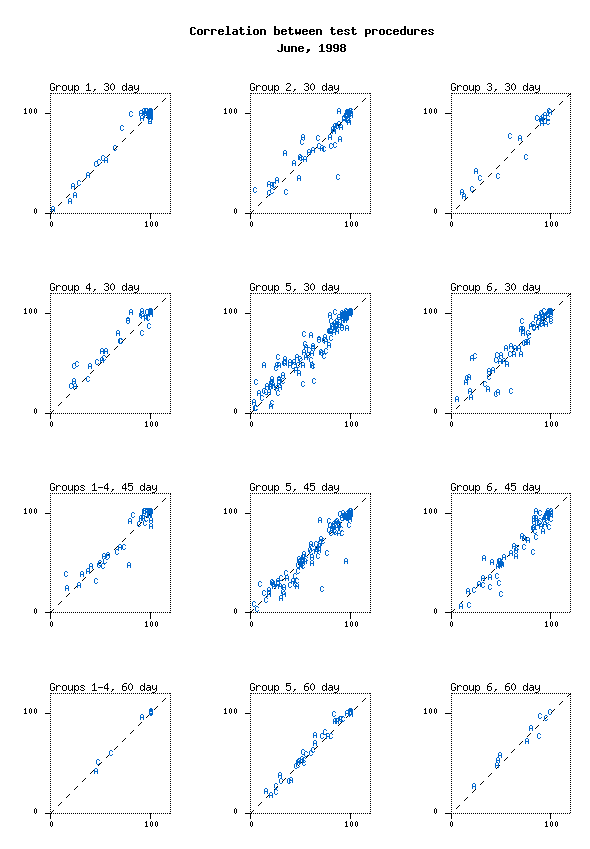
|
Plugin (MultiScat): %PLOTICUSPLOT{"MultiScat"}% |
Verbatim (MultiScat):
%PLOTICUSPLOT{"MultiScat"}%

Plot settings:
#proc page
  pagesize: 8.5 11
  #if @DEVICE in gif,png
    scale: 0.8 0.7
  #endif
  title: Correlation between test procedures
    June, 1998

#proc getdata
 file: vf.dat

#procdef areadef
  box: 1.5 1.5
  xrange: 0 120
  yrange: 0 120
  xaxis.stubs: inc 100
  xaxis.axisline: none
  yaxis.stubs: inc 100
  yaxis.axisline: none
  frame: width=0.5 style=1
  #saveas A

///// start with upper right hand corner plot
#proc areadef
  #clone A
  location: 1 8
  title: Group 1, 30 day

#proc line
  linedetails: width=0.5 style=1 dashscale=3
  points: min min max max
  #saveas L

#proc scatterplot
  select: @@2 = 1
  xfield: 5
  yfield: 6
  labelfield: 3
  #if @DEVICE in gif,png
  textdetails: color=blue
  #endif
  #saveas: S

////////////////////////////
#proc areadef
  title: Group 2, 30 day
  #clone A
  location: 3.5 8

#proc line
  #clone L

#proc scatterplot
  #clone S
  select: @@2 = 2

////////////////////////////
#proc areadef
  title: Group 3, 30 day
  #clone A
  location: 6 8

#proc line
  #clone L

#proc scatterplot
  #clone S
  select: @@2 = 3

////////////////////////////
#proc areadef
  title: Group 4, 30 day
  #clone A
  location: 1 5.5

#proc line
  #clone L

#proc scatterplot
  #clone S
  select: @@2 = 4

////////////////////////////
#proc areadef
  title: Group 5, 30 day
  #clone A
  location: 3.5 5.5

#proc line
  #clone L

#proc scatterplot
  #clone S
  select: @@2 = 5

////////////////////////////
#proc areadef
  title: Group 6, 30 day
  #clone A
  location: 6 5.5

#proc line
  #clone L

#proc scatterplot
  #clone S
  select: @@2 = 6

/////////////////////////////
#proc areadef
  title: Groups 1-4, 45 day
  #clone A
  location: 1 3

#proc line
  #clone L

#proc scatterplot
  select: @@2 in 1,2,3,4
  xfield: 7
  yfield: 8
  labelfield: 3
  #if @DEVICE in gif,png
  textdetails: color=blue
  #endif
  #saveas: S

/////////////////////////////
#proc areadef
  title: Group 5, 45 day
  #clone A
  location: 3.5 3

#proc line
  #clone L

#proc scatterplot
  #clone S
  select: @@2 = 5

/////////////////////////////
#proc areadef
  title: Group 6, 45 day
  #clone A
  location: 6 3

#proc line
  #clone L

#proc scatterplot
  #clone S
  select: @@2 = 6

/////////////////////////////
#proc areadef
  title: Groups 1-4, 60 day
  #clone A
  location: 1 0.5

#proc line
  #clone L

#proc scatterplot
  select: @@2 in 1,2,3,4
  xfield: 10
  yfield: 11
  labelfield: 3
  #if @DEVICE in gif,png
  textdetails: color=blue
  #endif
  #saveas: S

/////////////////////////////
#proc areadef
  title: Group 5, 60 day
  #clone A
  location: 3.5 0.5

#proc line
  #clone L

#proc scatterplot
  select: @@2 = 5
  #clone: S

/////////////////////////////
#proc areadef
  title: Group 6, 60 day
  #clone A
  location: 6 0.5

#proc line
  #clone L

#proc scatterplot
  select: @@2 = 6
  #clone: S
|
Drawing in Ploticus, Logo
Ploticus supports simple drawing, useful for annotation needs (has support for simple connected lines, some shapes, etc). - I have a feeling there's something not entirely right about this logo, but can't really put my finger at it?
Pre-rendered sample (DrawingLogo):
|
Plugin (DrawingLogo): %PLOTICUSPLOT{"DrawingLogo"}% |
Verbatim (DrawingLogo):
%PLOTICUSPLOT{"DrawingLogo"}%

Plot settings:
#proc page
pagesize: 8.5 11
#if @DEVICE in gif,png
  scale: 0.5
#endif

#proc drawcommands
commands:
  color blue
  linetype 0 2 1
  mov 1 9
  lin 2 9
  lin 1.5 10
  lin 1 9
  cblock 3 9 5 10 yelloworange 1
  mark 2.4 9.5 sym9agreen .5
  mov 1 9.5
  lin 5 9.5

#proc areadef
  rectangle: 1 7 5 9
  xrange: 0 30
  yrange: 0 10

#proc drawcommands
file: logo.dcm
|
Plugin Settings
- One line description, is shown in the TextFormattingRules topic:
- Set SHORTDESCRIPTION = Allows users to plot data and functions using Ploticus
- Debug plugin: (See output in
data/debug.txt) - Set DEBUG = 0
Plugin Installation Instructions
Note: You do not need to install anything on the browser to use this plugin. The following instructions are for the administrator who installs the plugin on the server where TWiki is running.- Download the ZIP file from the Plugin web (see below)
- Unzip
PloticusPlugin.zipin your twiki installation directory.
Content:File: Description: data/TWiki/PloticusPlugin.txtPlugin topic data/TWiki/PloticusPlugin.txt,vPlugin topic repository lib/TWiki/Plugins/PloticusPlugin.pmPlugin Perl module lib/TWiki/Plugins/PloticusPlugin/Plot.pmPerl module responsible for rendering the plot area lib/TWiki/Plugins/PloticusPlugin/PlotSettings.pmPerl module responsible for managing the settings
- In
/lib/TWiki/Plugins/PloticusPlugin/Plot.pmlook for the following line and update the paths to fit your environment:
# Update $ploticusPath, $ploticusHelperPath and $execCmd to fit your environment
- If your plugin is now correctly installed you should have fully interactive editable plots in the examples section
Plugin Info
| Plugin Author: | TWiki:Main.SteffenPoulsen (based on TWiki:Plugins.GnuPlotPlugin by TWiki:Main.AbieSwanepoel) |
| Plugin Version: | 29 Apr 2006: (V1.100) |
| Change History: | |
| 2012-11-27: | Item7060: PloticusPlugin is still editable when site mode is slave/readonly. |
| 2012-11-27: | Item7058: PloticusPlugin supports ploticus tag. |
| 29 Apr 2006: | (v1.100) - Added sandbox security mechanism |
| 27 Apr 2006: | (v1.000) - Initial version |
| TWiki Dependency: | $TWiki::Plugins::VERSION 1.1 |
| CPAN Dependencies: | none |
| Other Dependencies: | Ploticus (available from http://ploticus.sourceforge.net/) |
| Perl Version: | 5.005 |
| License: | GPL ( GNU General Public License) |
| Benchmarks: | GoodStyle 99%, FormattedSearch 99%, PloticusPlugin 98% |
| Plugin Home: | http://TWiki.org/cgi-bin/view/Plugins/PloticusPlugin |
| Feedback: | http://TWiki.org/cgi-bin/view/Plugins/PloticusPluginDev |
| Appraisal: | http://TWiki.org/cgi-bin/view/Plugins/PloticusPluginAppraisal |
Topic revision: r0 - 2012-11-27 - TWikiContributor

 |
|
Ideas, requests, problems regarding TWiki? Send feedback
Note: Please contribute updates to this topic on TWiki.org at TWiki:TWiki.PloticusPlugin.